
Beautiful Classic Collectables
- The Publishing Post

- Apr 13, 2021
- 3 min read
By Maisie Jane Garvin, Juliette Tulloch and Beth Gater


Penguin’s Vintage Japanese Classics
This is a vibrant collection created by artist Yuko Shimizu and spans a century of Japanese fiction. Shimizu’s style stems from her love of imitating Japanese comic books and TV cartoons as she grew up in the 1960s and 70s. Instead of following the trend of anime-styled art or forced into American styles when she moved to New York, she clearly embraced a more vintage and soft style. Primary colours of red, blue, yellow and green are used throughout, while the simple white logo and inscribed title in red take inspiration from Japanese packaging. This design unites all these seemingly different authors as influential classics, but sustains the individuality of these stories with a composition of different lines and overlays - including a poignant singular quote on the back of each book.
Perhaps less known of, Natsuo Kirino's 1997 Out was a groundbreaking novel in the world of crime fiction, particularly for female authors and readers. It liberated women’s bodies with its discussions on marriage and family in Japan, following the lives of four women from the Tokyo suburbs working at a graveyard. The looming yet vibrant sunset implies all is now what it seems, while the striking crows evoke feelings of horror and dramatic writing. These warm undertones are also used in Ogawa’s The Housekeeper and the Professor, which explores the unusual family unit, symbolised by the three birds.
Yukio Mishima’s 2019 novel, The Sailor Who Fell from Grace with the Sea, is a sinister novel about the corruption of a group of teenage boys. The boys display sociopathic tendencies and participate in cruel and disturbing acts. It is a sad and violent tale that ultimately aims to show how evil can be created instead of inherited. The boys begin the novel as a normal group of teenagers until they become corrupted by evil through each other’s influence. The cover design shows a mirror image of the sun and a lighthouse. Perhaps the contrasting images represent the good and evil within the boys as they know what they are doing is wrong, but they continue to become more corrupt. Additionally, the fact the lighthouse is underneath the water perhaps suggests a repressed conscience or that the good within the teenagers has submerged below the surface. Furthermore, the imagery of the sea represents the sailor but also the turbulent and violent nature of the novel itself. It also implies the novel is unpredictable and keeps the reader on edge.
Other authors included are Murakami, Tanizaki and Ogawa - all influential novelists who offer a wide introduction to Japanese writing. Check out Shimizu’s website and her Instagram for the process of her artwork. You can purchase the whole collection here.
Chiltern Classics
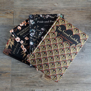
Bursting onto the publishing scene in 2018, Chiltern Publishing aims to create beautiful books using the first published editions of the classics as inspiration. Hugely drawing on the first edition of Jane Austen’s Pride and Prejudice, the collection matches each of their books to match this size, with intrinsically detailed covers and sparkling gilt edges to the pages. In using the latest printing techniques but sticking to a traditional design, the Chiltern Classics bring a sophisticated and timely feel to any bookworm’s library. The collection covers a wide scope with only more titles set to be published as the year continues; the novels included range from the famous works of Charles Dickens, to children’s classics such as Alice’s Adventures in Wonderland. All information surrounding prices and the extensive list of the authors included within the collection can be found at the Chiltern Publishing website here.
One of the most noticeable covers in the collection is The Great Gatsby by F. Scott Fitzgerald, perhaps one of literature’s best-loved classics and Chiltern’s edition will certainly not disappoint lovers of the story. The beautiful gold, black and red fan pattern that adorns the front can be instantly recognisable as 1920s art deco style, echoing the decadence of the era within which the novel is set. Even the title is printed in gold, representative of the money and affluence Gatsby holds from the opening pages. The sparkling edged pages only add to the aesthetics of this edition, making it look like it has been snatched straight out of the roaring 20s onto your shelf.


