A Golden Age of Gold Foil
- The Publishing Post

- Aug 15, 2020
- 4 min read
In this issue of The Publishing Post’s Cover Design feature, we’re excited to be delving into the production elements of The Binding by Bridget Collins. Published in 2019 by The Borough Press, The Binding tells the story of Emmett, a young farmer suddenly whisked away from everything he knows to become a bookbinder’s apprentice. But in Collins’ world, bookbinding is a feared and shameful profession. Emmett soon discovers that the books locked away in the workshop contain more than just stories invented to entertain - they contain people's darkest and most painful memories, ones they would rather forget than live with.
We were very fortunate to speak with cover designer Micaela Alcaino to find out more about the inspiration and intention behind The Binding’s stunning and intriguing cover.
Gold Foil
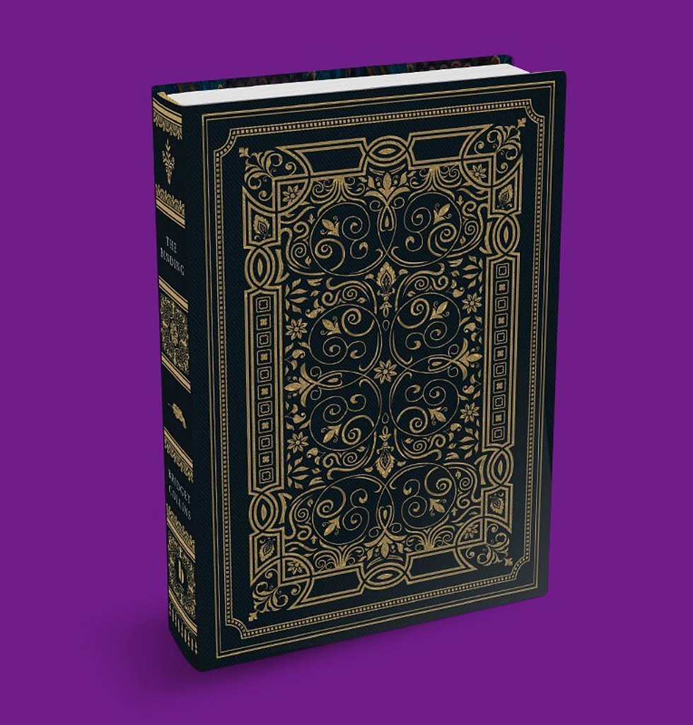
The Binding’s gold foil design is a standout aspect of its appearance, turning heads in bookshops and encouraging collectors of aesthetically-beautiful titles to examine it closer. Foiling is a popular printing technique that uses foil stamping to debase lettering, design or logos into a cover or surface. Cloth covers, and some types of paper, while typically of a higher quality, sometimes struggle with being printed on. But using an embossing machine, production teams and cover artists are able to imprint detailed, bespoke designs onto premium covers.
The Binding is a beautiful example of intricate gold foiling technique, one which adds a wonderfully warm feeling of elegance and masterful design. Cover Designer Micaela Alcaino says she was “inspired by the old, beautiful hardbacks that I collect which are all very simple, yet beautifully designed with gold foil.” Further inspiration came from the novel’s content, with Alcaino adding, “Old, beautiful and gold-foiled leather bound books play a massive role in The Binding, so I almost wanted to create the cover to be its own prop to the story.” Very rightfully so, The Binding won in the Beautiful Book category of the ‘Books Are My Bag Readers Awards 2019.’

The hardcover edition of The Binding, in all its variations, feels exclusive and well-worth collecting, seeming to stand out on the display tables and shelves of booksellers. Its design elements come together to create a Regency-era literature style with its vintage spine detail, the intricate gold foiling pattern upon dark-coloured bookcloth, as well as a striking sprayed edge seen on select editions.
Patterning and Symbolism

When we asked Micaela Alcaino about the particular narrative elements she wanted to capture and highlight in the cover design for The Binding, she discussed wanting to “convey the mood of the book, rather than particular elements” of the story. “Bridget’s writing has a sense of dark, mysterious, poetical feeling to it,” Alcaino says, “and I thought, who better to convey it than William Morris.” William Morris was a 19th century textile designer, and it is his evocative floral patterning that has been incorporated into the background of The Binding’s cover. In The Collected Works of William Morris, Morris writes about wanting to achieve “a look of satisfying mystery” in his designs and, with this in mind, it is clear why his work was the perfect choice for the cover of The Binding. The blue and gold interwoven floral patterning is worked beautifully into the design and very effectively adds to the dark, mysterious atmosphere that Alcaino was hoping to capture.
The beautiful and old-fashioned key which appears in the lower third of the cover contributes to the antique feeling of the design, while also representing the mysterious and secretive world in which The Binding is set. Bookbinders possess the ability to lock a person’s darkest, most painful memories within the pages of books, and this important aspect of the story is symbolised by the key on the cover.
Beautiful Endpapers

The Binding has specially designed endpapers which Alcaino admits she was “quite proud of.” The endpapers are a beautiful marble design in a range of dark blue and yellow-orange shades that match with the blue and gold foil. Patterned endpapers are rare in modern hardback books. Most endpapers are plain colours that either match the paper colour or match the cover colour. This makes the book feel exclusive and helps create a Regency-era literature style that calls upon the extravagances of the time to create the design features of the book as a whole.
The use of a bookplate with ornate design and an 'ex libris' label is a nod to the literature of old which helps to “bring back that old book feel,” a medium Alcaino uses to convey the mood of the book. The bookplate also ties in nicely with The Binding’s theme that books contain a person's memories. By writing your name as the owner of the book, it may capture certain memories you have whilst reading the book. You can remember these memories by going back to the book at any time. This book can then be passed down to future generations and possibly connect with the memory of their ancestors whilst reading the book. Allowing people to write their name on the bookplate may play into Alcaino’s aim ‘to want people to be proud to own not just the story but the hardback itself.”
A sincere thank you to Micaela Alcaino for answering our burning production questions and providing insight into the creation of this beautiful, award-winning cover design.


